Is Your Restaurant Booking Widget Costing You Reservations? 5 Mobile-First Fixes
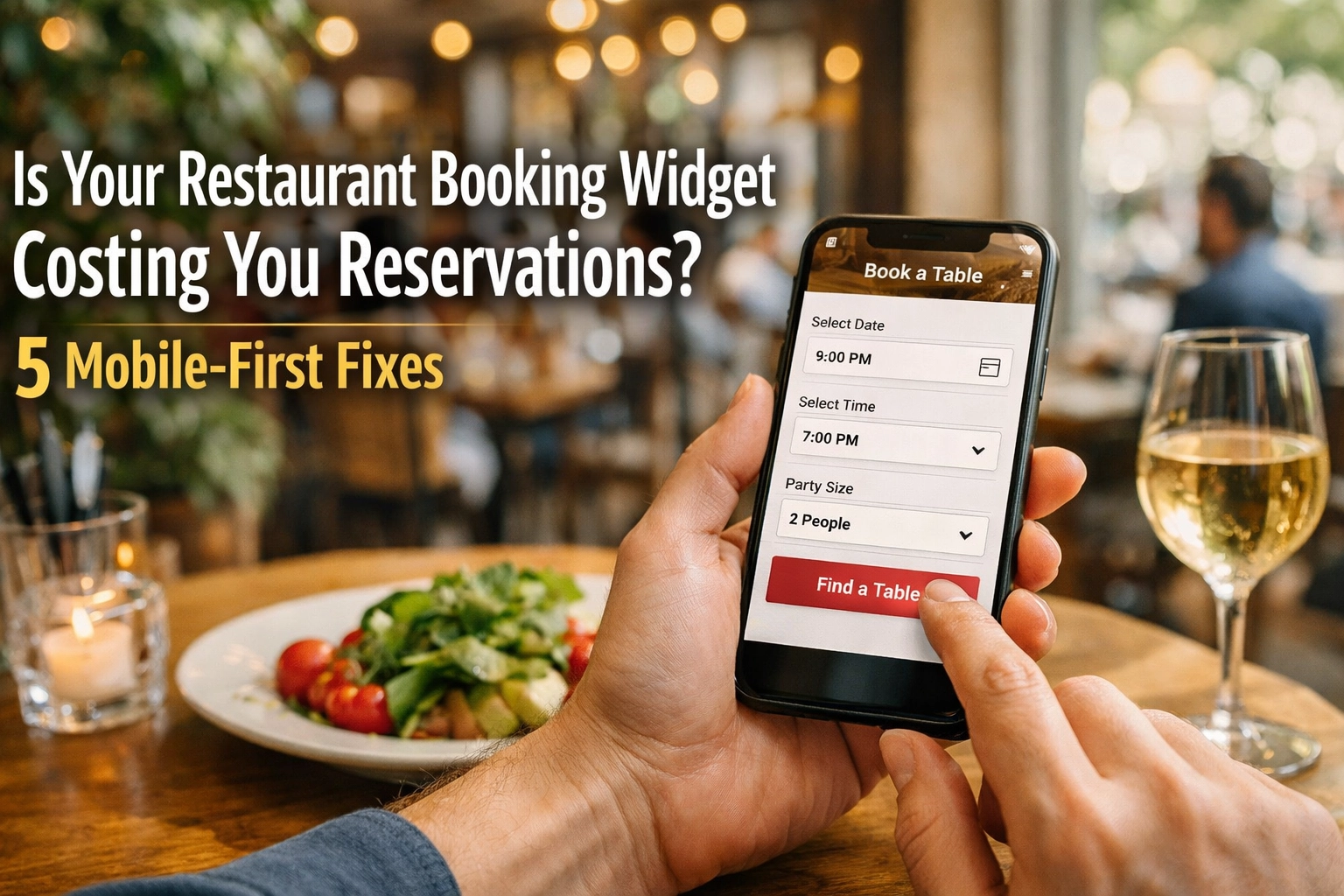
Here's a sobering thought: 73% of restaurant reservations now happen on mobile devices. Yet most booking widgets are still built for desktop screens.
That clunky interface on your website? It's haemorrhaging potential bookings every single day. A slow-loading widget, buried buttons, or a confusing layout means diners are abandoning their reservation mid-flow and moving on to your competitor down the street.
The good news? These aren't complicated technical problems. They're design choices. And fixing them can transform your conversion rate overnight.
Let's walk through the five critical mobile-first fixes that separate restaurants drowning in no-shows from those with fully booked services.
1. Move Your Booking Button Above the Fold
Your "Book a Table" button is the most valuable piece of real estate on your entire website. Yet it's probably hiding below the fold where half your visitors will never see it.
On mobile screens, the fold is brutal. You've got maybe 600 pixels of vertical space before users have to scroll. If your booking CTA isn't visible in that initial view, you're losing reservations before the game even starts.
The fix: Position your booking button prominently in your header navigation. Make it contrast with everything else on the page. Use action-oriented text like "Book Now" or "Reserve Your Table" instead of generic "Reservations" links.
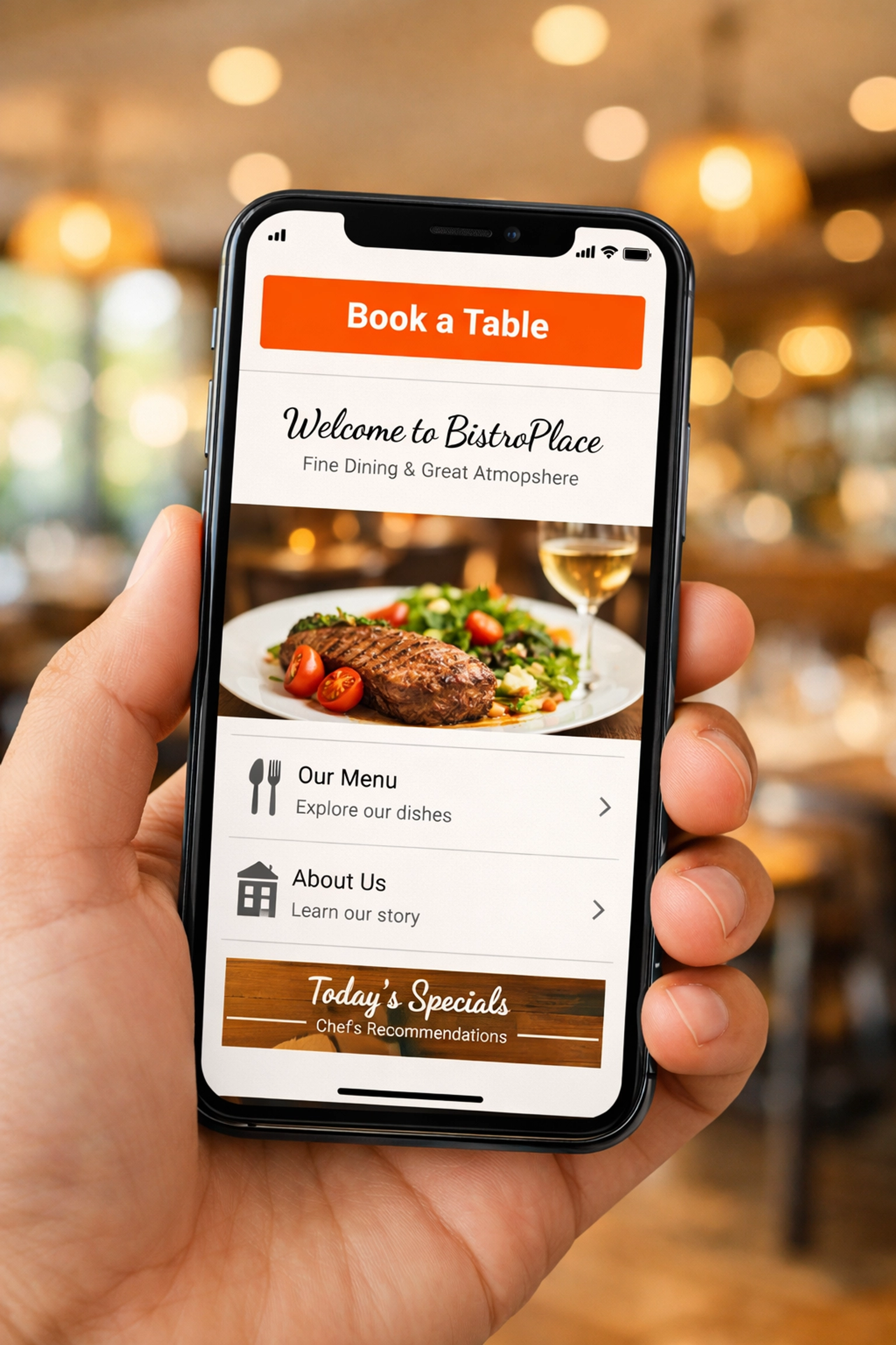
Better yet, use a sticky header that keeps your booking button visible as users scroll through your menu or browse photos. The moment a potential diner decides they want to eat at your restaurant, your booking widget should be one tap away.
This isn't about aesthetics. It's about removing friction at the exact moment someone's ready to convert. Every additional second they spend hunting for your booking system is another chance for them to bounce.
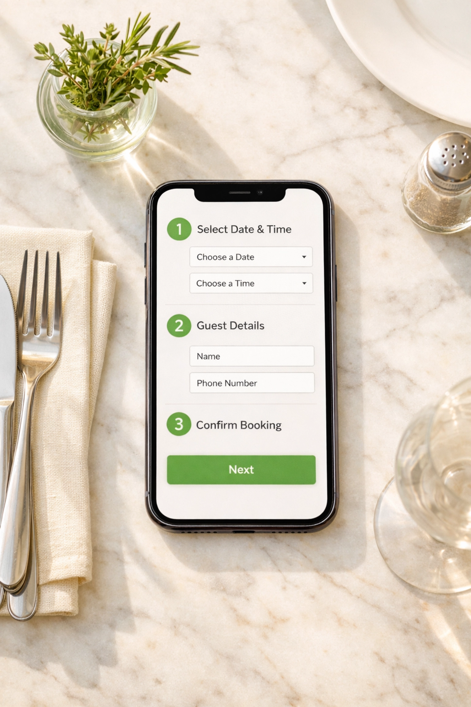
2. Streamline Your Booking Flow to Three Steps or Less
Here's where most restaurant booking widgets fall apart: they ask for too much, too soon.
A typical booking disaster looks like this: Select date. Select time. Enter party size. Create an account. Verify email. Enter payment details. Accept terms and conditions. Confirm booking. By step four, half your potential diners have already given up and ordered pizza instead.
The winning formula: Date, time, party size. That's it for the first screen. Collect name and contact details on the confirmation screen. Everything else is noise.
Your booking flow should load instantly and feel effortless. Sully Booking's mobile-first interface does exactly this: lightning-fast load times and a streamlined three-step process that converts browsers into bookings. No clutter. No confusion. Just a simple path from "I'm hungry" to "reservation confirmed."
Every additional field you add to your booking form is a conversion killer. Ask yourself: do you really need their postal code? Does dietary information need to be mandatory? Strip it back to essentials. You can always collect additional details via email confirmation or when they arrive.
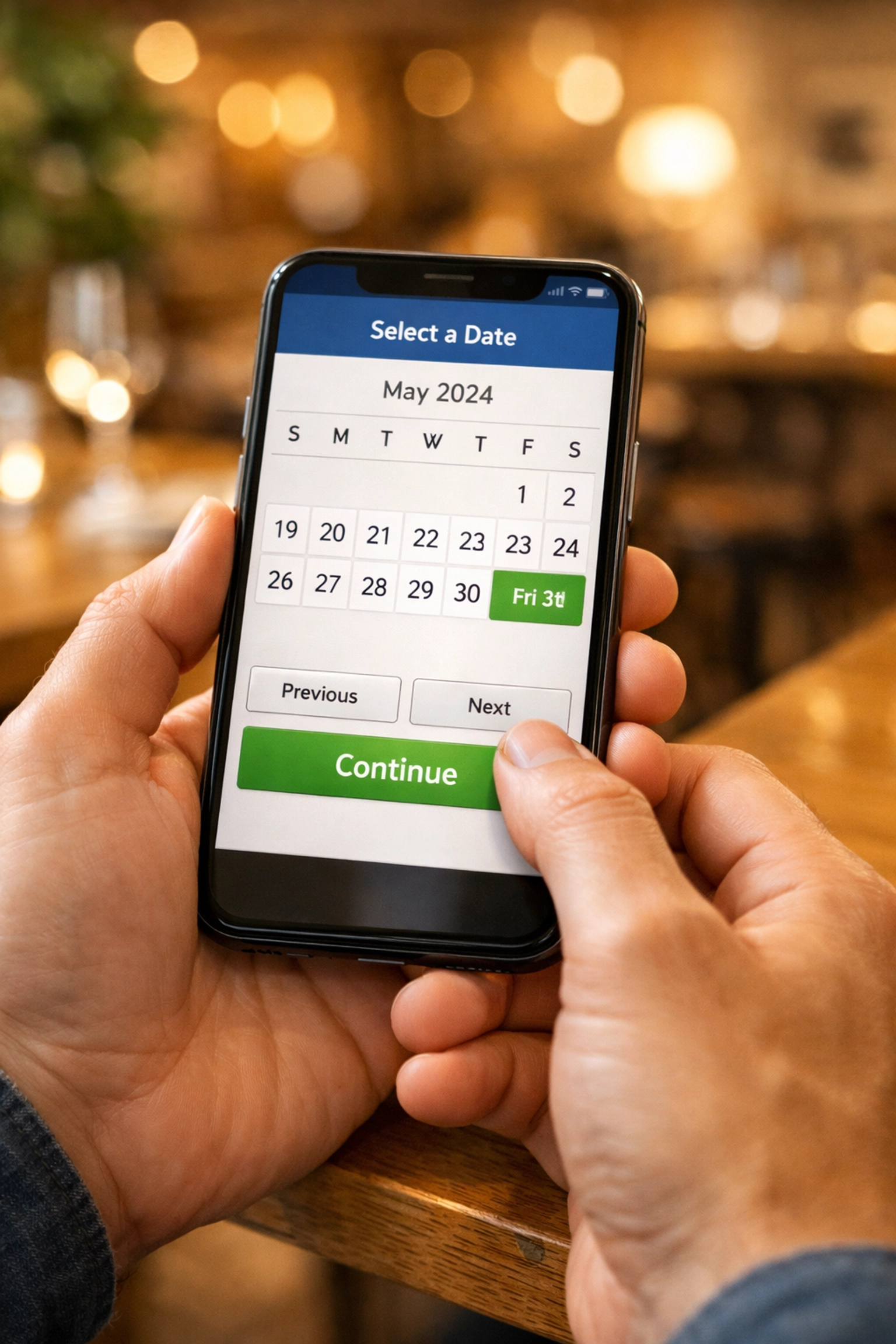
3. Design for Thumbs, Not Mouse Cursors
Mobile booking widgets fail when they're built for desktop and retrofitted for phones. The result? Tiny tap targets, awkward date pickers, and forms that require zooming to complete.
Your booking widget needs to be designed mobile-first from the ground up. That means touch-friendly buttons (minimum 48x48 pixels), generous spacing between interactive elements, and form inputs large enough to type into without frustration.
Date and time selectors are particularly critical. Those miniature calendar grids from desktop widgets? Nightmare on mobile. Users should be able to swipe through dates and tap clear time slots without precision targeting.
The technical reality: If your widget requires users to pinch-zoom or double-tap to select elements, you're actively sabotaging your conversion rate. Modern booking systems use native mobile patterns that feel natural on touchscreens.
This is where Sully Booking's single-line code integration becomes invaluable. Drop it into your website and you get a fully responsive, genuinely mobile-optimised booking widget that adapts seamlessly to any screen size. No custom development needed. No separate mobile version to maintain.
4. Kill the Loading Spinners
Speed isn't a nice-to-have feature. It's the difference between a completed booking and an abandoned cart.
If your booking widget takes more than two seconds to load, you're losing reservations. Mobile users are ruthless: they'll bounce the instant they sense lag. A spinning loader icon might as well be a "Closed" sign.
The problem often isn't your booking system itself. It's the bloat around it. Heavy JavaScript frameworks, unoptimised images, and third-party tracking scripts all add weight. Your widget might be technically functional but so slow that users never stick around to find out.
The speed checklist:
- Widget loads in under 1.5 seconds on 4G connections
- Date pickers appear instantly when tapped
- No full-page reloads between booking steps
- Confirmation screen appears immediately after submission
White-label booking systems like Sully Booking are built for speed from the architecture up. Clean code. Optimised assets. Server-side rendering where it matters. The result? A booking experience that feels instantaneous even on patchy mobile connections.
Remember: every second of delay costs you bookings. Google found that 53% of mobile users abandon sites that take longer than three seconds to load. Your booking widget needs to be faster than that.
5. Build Trust Within the Booking Flow
Here's what most restaurant owners miss: diners hesitate before booking because they're uncertain. Is this place legit? Will they actually honour my reservation? What if the reviews are fake?
Your booking widget needs to answer these questions without users leaving the page. That means integrating social proof directly into the booking experience.
Display your Google rating prominently. Show recent reviews from verified diners. Include hygiene ratings if they're strong. Feature awards or press mentions. All of this belongs in or immediately adjacent to your booking widget.
The psychology is simple: seeing that 4.7-star rating with 300+ reviews transforms a hesitant browser into a confident booker. Without visible social proof, potential diners second-guess themselves mid-booking and bail to do more research.
The trust elements that convert:
- Star rating visible on booking screen
- Number of bookings made this week
- "Verified diners" badges
- Cancellation policy clearly stated
- Secure payment indicators
With a white-label solution like Sully Booking, you maintain complete control over your brand presentation while embedding these trust signals naturally. No clunky third-party logos or "Powered by" footers that undermine your professional image.
The Bottom Line: Your Widget Is Your Front Door
Most restaurants obsess over their physical space: the lighting, the music, the table settings. Yet they treat their booking widget like an afterthought.
Your widget is where first impressions happen. It's where potential diners decide whether you're a professional operation or an amateur outfit. A clunky, slow, confusing booking experience doesn't just cost you that one reservation. It damages your brand perception.
The mobile-first fixes outlined here aren't expensive or complex. They're about respecting your diners' time and making the path to booking as frictionless as possible. Get these right and you'll see immediate improvement in conversion rates.
Every lost booking represents lost revenue. If your widget is costing you even three reservations per day, that's potentially thousands in monthly revenue walking out the door. The opportunity cost of a poor booking experience is massive.
Ready to see what a genuinely mobile-optimised booking system looks like? Sully Booking offers the lightning-fast, mobile-first widget that converts browsers into diners. Simple integration. Zero friction. Maximum bookings.
Your tables won't fill themselves. But the right booking widget can make it a whole lot easier.